
If you’re looking for your next, or even first community platform, then I hope this honest Circle.so review will help you.
Personally, I can’t stand super biased reviews, so, whilst full-disclosure; this review does contain affiliate links, I also made sure to include what I honestly don’t love about Circle, as well as who Circle definitely isn’t for.
Ultimately I’m a huge fan of the Circle.so platform, but each community has it own set of requirements and considerations. I hope this Circle.so review will help you to make the right choice for your community.

Circle.so Review:
What I don’t love about the Circle.so community platform
Let’s start with the negatives… because why not.
The UI doesn’t allow much customisation
Honestly, this hasn’t been a big deal for me personally, as I find the UI tremendously intuitive. However, I know some community builders I work with require more customisation than what Circle.so can offer. If you want to totally customise the look and structure of your community, then it may not be the right platform for you.
In Circle you can customise your logo, the colours and of course the sections (or as they call them ‘spaces’) that you set up. But you can’t literally break the entire layout apart to fit your specific needs. Again – not something I find myself wanting to do, but for some folk, it’s a deal breaker.
They’re still very new as a platform
Circle.so haven’t been around that long. That’s both a good and bad thing. I love their hungry start-up energy right now – it’s actually inspiring to see how fast they’re growing and how rapidly they’re iterating. However, with any startup I always have in the back of my mind ‘what if they fail spectacularly’ – particularly as I’m tying a LOT of my communities and a lot of effort/content into their platform. I don’t believe that will happen, but it’s different compared to trusting in something like Shopify (obv not a community platform, but an e-commerce one) – as you can be pretty sure they’re going to exist in 10-20 years time!
That being said, most of the established players in the community platform space feel positively sluggish compared to the fresh energy that Circle.so have brought into the industry. So again, not a huge negative, but something to bear in mind.
What will happen as they scale?
Assuming Circle.so are around for the long-term, I hope that they scale gracefully. They’re nailing their progress and growth roadmap right now, but it begs the question – what will this platform/company look like at X10, X100 the size they are now? Hopefully it’ll be growth for the better, but you never know…
The analytics are ok, but not super in depth
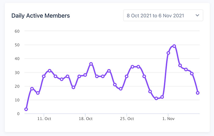
Circle.so do offer Analytics, but only on their $79 plan, not the $39 plan. It’s an effective incentive to upgrade, but as a community builder who loves data, they’re a little on the basic side.
You can see top level metrics at a glance – daily/monthly active members, number of posts, topics created, member joining etc… However, if you want more granular data on member’s activity, you have to manually dig through their profile, there’s no native reporting. You can download CSVs, which offer a little more data, but I’d love to see Circle develop a more robust analytics area within the platform itself.
No native emailing
You can set up new posts or events within certain spaces to email all members when they’re created. You can also turn on a ‘weekly digest’ which emails a summary of your community (popular posts and the like).
However, it would be nice to be able to send out ad-hoc emails to members outside of these existing channels. Currently I have to cross-reference my member’s emails with my newsletter subscribers (thank you GDPR!) which is manually and annoying.
That being said, I can understand why Circle are avoiding acting more like an email marketing platform. They’re staying in their lane (community) and doing it damn well. Particularly for an early stage start-up, I’d rather see them continue to rapidly iterate on their core community product than start adding endless bells and whistles for email.
Small bugs/glitches
Circle have recently made speed improvements, but occasionally the platform can take longer than you’d like to load. I feel hopeful these teething speed issues will be resolved in the near future.
There’s also occasional bizarre bugs. My biggest pet peeve is that when I click ‘like’ on more than one member’s post in the home feed, it erratically jumps me down to the post below. I think it’s some weird anomaly where I have multiple comment sections open, but still – it’s one of those things that makes me die a little inside every time it happens. To be fair – Circle are typically great at resolving reported bugs, and I’ve been too lazy to report this one.
Their mobile app needs work
Again, I understand Circle’s desire to focus on their core offering, but it means that peripheral offerings like their mobile app don’t quite live up to the core community platform. For example – one of my members recently spotted that they couldn’t edit their posts within the mobile app – something you’d hope would be basic functionality baked in.
Default notifications seem to be a lot
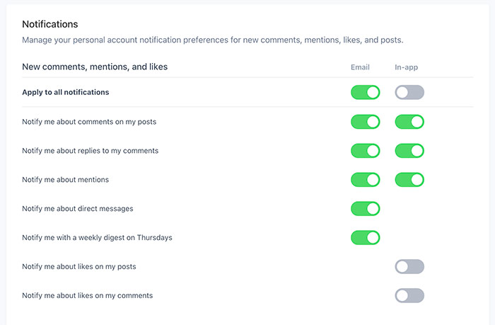
Within my community onboarding I have to encourage members to go to their notifications settings and customise them right away. This is partly because Circle.so default notification settings seem a little intense. New members can easily become bombarded. Thankfully the notification settings for members are intuitive, yet robust, but still – I’d rather fix this issue at the source, with better default settings.
As you can see, most of these negatives are niggles, rather than deal breakers. Sure, some can be a little frustrating, but as you’re about to read, there’s a lot more that I love about Circle.so than what I don’t love.
What I love about the Circle.so community platform
Circle are regularly rolling out new features and they’re always super well thought out
I’ve been so impressed with how quickly Circle iterate their product. In the 3 months or so we’ve been using them, they’ve released a plethora of features, some that I’ll cover further down this list.
The point is, I feel like the platform and product gets X2 better every couple of months! That’s huge. It feels like my investment in the platform continues to pay off, as I can do more and more awesome stuff for my members each month. Often I’ll mentioned something that I’d love to see and their team let me know it’s imminently being released as part of their development roadmap.
Circle launched paywalls!
One of these recent features was paywalls! This was huge for me, as I run a paid community at Learn.Community. Prior to paywalls, you had to do a bunch of messy Zapier/Stripe integrations and as someone very much non-technical, that was a headache I wasn’t willing to endure.
The paywalls feature, like everything Circle seem to roll out was very intuitive to use, had great guides/support and has been a game-changer for my community and business.

Circle allows me to consolidate my community offerings
I hate when communities cobble together multiple platforms and offerings into a messy experience for their members. In the past, I’ve been forced to do this myself, due to the lack of a quality consolidated option.
This was one of the biggest reasons that I was excited to get started using Circle. In one platform I can:
- Host an active forum
- Organise and distribute content
- Manage my members
- Charge members
- Coming soon: Live stream (I can’t wait for this next roll-out – no more Zoom!!!)
I firmly believe that keeping all of your members experiences under one roof, on a single platform is powerful and prevents a dilution of your value as community leader (plus it means less admin/cost managing multiple platforms).
Circle has a really clean, intuitive UI
I never see a member confused with how to use the Circle platform. From posting to commenting, uploading, sharing images etc… All of that day to day usage is just super intuitive. It’s a joy to see our members just ‘get it’ right out the gate. I definitely can’t say that for past platforms we’ve used.
Sometimes people say ‘looks a little like Facebook’. I guess… if Facebook stripped out its endless ads, removed all the icky distractions and was actually pleasant to use.
I personally love the UI of Circle. It’s clean, modern and easy.

They have pretty awesome customer support
Every time I email Circle (which has been a lot recently, as I push what we can do with the platform), I’ll always hear back within 24 hours. I’d give them an 8/10, as a couple of times the response feel a little generic. However, that’s 8/10 by my standards (and I push my team to offer the best customer care in the world). Their team seem lovely, helpful and responsive. Can’t ask for much more than that!
Their team are amazing!
Speaking of team, beyond just their customer service department, everyone I’ve encountered on their team has been lovely. I’ve tweeted with the founders. I’ve worked closely with Mathilde on their community team. Everyone to a fault has been delightful. That matters to me. That makes me like and trust a company much more than if they’re a faceless, corporate behemoth.
It’s the best community experience I’ve seen
Ultimately, as community builders, what matters most is the experience of our members.
I’ve used various community platforms over the years and Circle are by far the best I’ve seen. When my friend Dan linked me to the platform earlier this year, I watched their overview video and immediately got that gut feeling when I’ve stumbled across something special.
The platform lived up to that video and actually exceeded it. These guys know how to build a killer platform. They understand community. Honestly, using Circle is like using the platform I always wished existed in this space.
WordPress SSO was smooth to integrate.
My company DesignCuts.com use Circle, and we integrated SSO so that our members can one-click login using their existing accounts with us. Our dev team (who are used to me throwing complex things are them) were pleasantly surprised at how easy Circle SSO was to integrate. In fact, it was one of our quickest dev projects all year, it was that smooth.
Circle also integrate SSO with a host of other platforms.

You can embed spaces directly into your website
This feature is pretty cool, although honestly, not one we’ve used yet (it’s in our 2022 roadmap). As well as your Circle.so community living on it’s stand-alone platform, you can embed the whole community, or individual spaces (sections) into your website in a kind of native frame.
For example – at DesignCuts.com if we have a blog article talking about the power of sharing your creative work that’s getting a ton of traffic – we can natively embed the ‘share your work’ space of our Circle community right below that post. It’s seamless and I’m so excited to roll this out across our website.
Rich posts
I love that it’s super intuitive with Circle to embed gifs, videos, images etc… into your posts. I’ll often reply to members using a spontaneous Loom video response that I can embed in 1 second flat. Or mix up the conversation using a well placed gif :).

Their support community are super helpful
The Circle private customer community is a gold-mine. Often I’ll find answers to questions without ever needing to contact their support team, but if I do need help, their team and other members are quick to respond.
No code!
Anyone who knows me knows that I’m hopelessly untechnical (embarrassing as the CEO of an online startup…). This means that I particularly appreciate no-code solutions like Circle, so that myself and my team can quickly build out our community platform, without ever bothering our developers.
Control over spaces
I really love how you can control the different spaces in your community. Spaces can be set to be ‘public’, ‘private’ or ‘secret’. When you get to understand this functionality you can really have some fun with it. For example – we’re working on launching a private subscription product for our customer base, and are currently building this all out in a secret space, that only our team can access.
GDPR compliance
Not much to say here, apart from it’s a huge headache when platforms aren’t GDPR compliant. Thankfully, Circle are.
Events functionality
This recent feature release has been a game-changer. I can now setup events right in Circle. Members can RSVP, get email reminders, add events to their calendar (auto-adjusting to their time-zones) and the whole experience is a dream. It’s knocked tons of work off the event setup process. Love it!

Custom domain
It was pretty easy (at least with help from their team – remember, I suck at technical things!) to setup my custom community domain.
Side note: I’m still ridiculously in love with my domain: learn.community (a community for community builders – how perfect is that!?).
Anyway, I love that members can visit that domain and immediately be taken to the thriving forum platform.
My overall thoughts about Circle.so
I hope this Circle.so review has been helpful. I’ve been as impartial and objective as possible.
Ultimately, no platform is perfect. I’ve been blown away and hugely impressed by Circle so far, despite a few small snags.
Over the years I’ve used various community platforms that have been expensive, clunky, dated and ultimately failed us.
Circle is in my opinion, hands down the best community forum platform out there today. I use it for my company’s community and my personal community. As ‘the community building guy’ I’m incredibly fussy when it comes to platforms, but I’m 100% sticking with Circle for the future.
If they continue iterating as rapidly as they are, the sky is the limit!
Want to check out Circle?
Check out the Circle.so community platform here.
(This is an affiliate link – I was already raving about Circle to everyone I know, before this official Circle.so review, so if you do sign up with them through my link, I get a small commission, and the karma fairies will thank you for supporting a fellow entrepreneur).
Oh, and if you’re not sure if you should be focused on building an audience or a community, check out my helpful guide on Communities vs Audiences.



Thank u for sharing about platforms…
I was thinking about which is the right platform for me for the past few months! so, this blog is just in time for me.
I have less than 10 members to be started with..
I will wait till I have more members to start with the circle community.
I have a WhatsApp group to help my community and a Facebook group to give them assignments n I use the zoom platform to teach them.
Though hopping from one platform to another is a Challenge but with small groups, I can manage them.
I’m so glad this review was helpful Neeta! Circle is a truly amazing platform, but I think it’s important to get clarity on what kinds of communities it’s best suited for.
What a brilliant review. I am so far off setting up my community but I have been thinking about how i want it to work and a big part of that is folder based. Learning about the ‘Events Functionality’ and the gated areas made me think about this more seriously.
Thanks Paul! I love Circle, if you have any questions about the platform lmk.